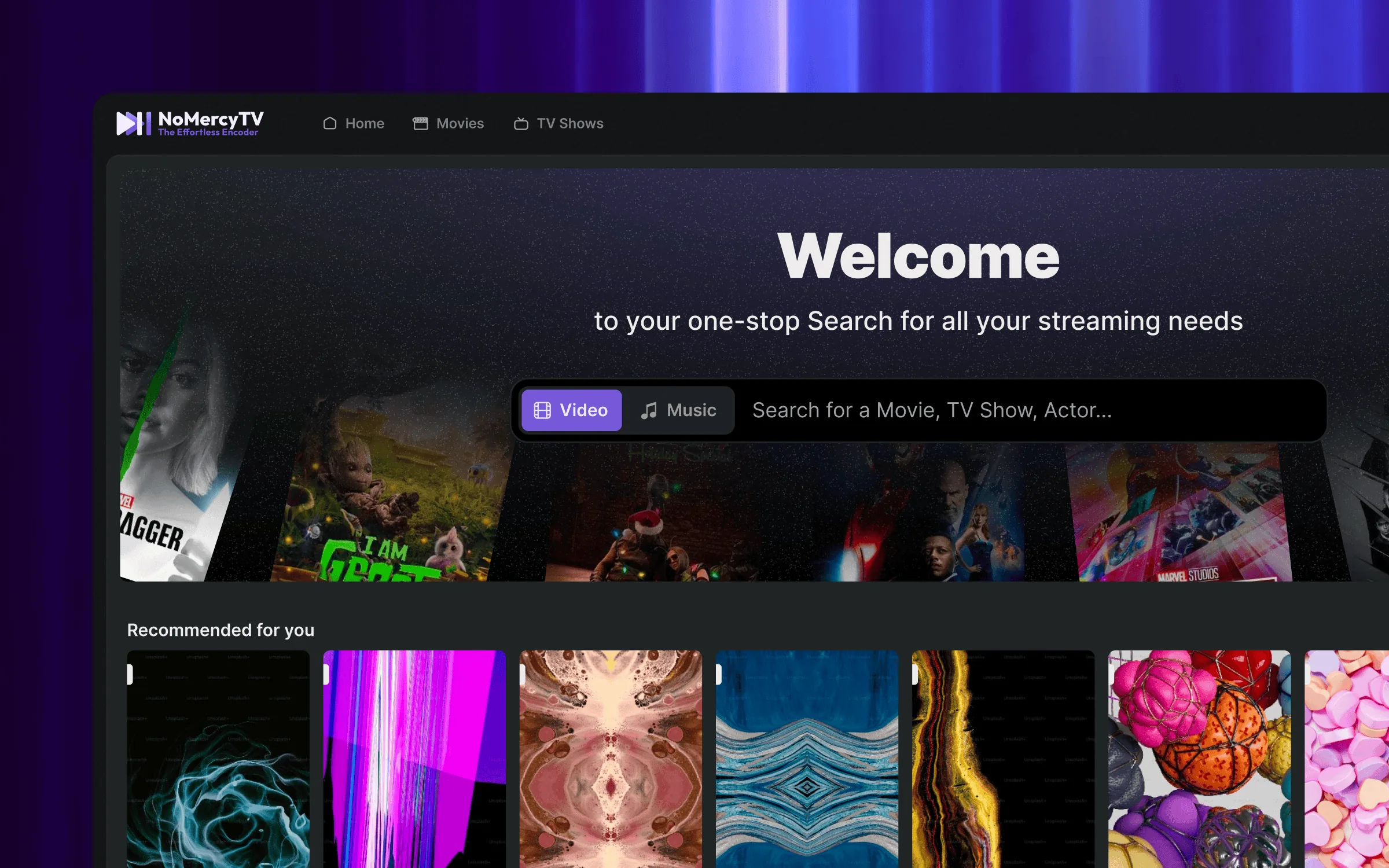
A self-hosted media server that makes owning your media feel as effortless as renting it, if self-hosting demands a manual, Netflix wins by default.
Design Advisory · Self-hosted Media Server · 2022–Present
01 · The Engagement
A solo developer asked for design feedback on a media server they were building. The interface used Material Design without adapting it to the product. Each screen followed different layout rules, and navigation was unpredictable. These are common results when a technical founder focuses on what a product does rather than how it feels to use.
The feedback loop made this engagement different. The founder started making changes during our sessions, while I was still explaining why. A layout could be rebuilt within minutes of our discussion. The first "call" was meant to be a one-hour audit, but ran for three hours without either of us noticing. It became a weekly consulting routine that has continued for four years. Every interface decision is a shared discussion, not a design handoff.
02 · The Opportunity
Plex had been the standard for self-hosted media, but its interface began to favour its own content and subscriptions over the user's library. Netflix created the opposite problem: a favourite movie stays only until its licence expires. Physical media is declining, while renting everything without ownership is becoming normal.
The goal was clear: make owning digital media as easy as using a streaming service. The challenge was the experience, not the technology. The interface had to feel as polished as Netflix while giving users full control of their library.
03 · The Work
The original interface had no design system. Every view used default Material components without adapting them to the product. A cosmetic change would not fix broken interaction patterns. We decided to rebuild the full front end around shared components and navigation principles for the server interface, web app, and mobile clients.
Usability does not limit depth; it multiplies its value. A user-friendly interface does not restrict power users. It simply lowers the barrier for everyone else.
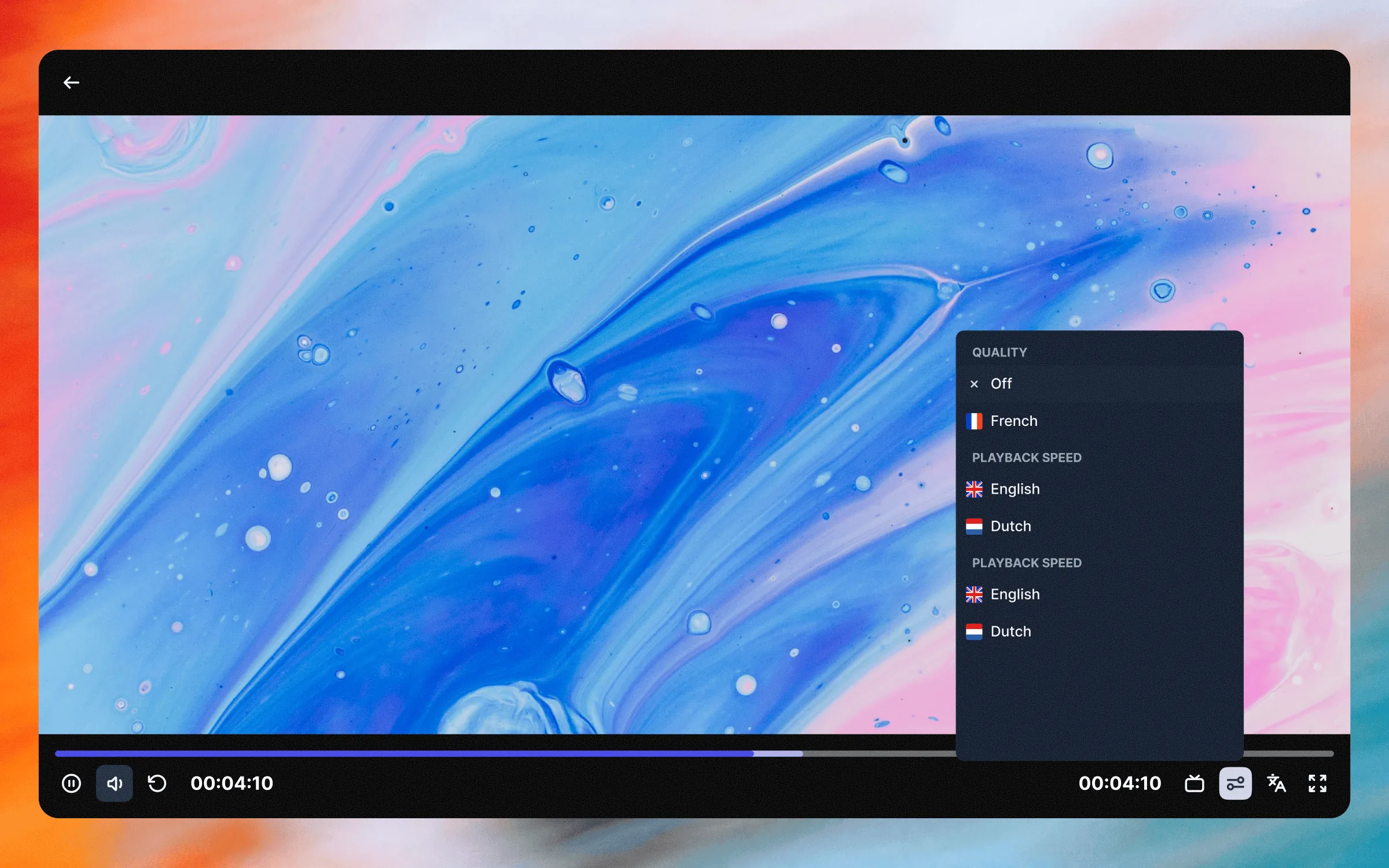
The main design tension was the audience. The developer was building for people like themselves: power users comfortable with servers and terminals. I argued that a self-hosted product competing with Plex could not require technical expertise. Our benchmark was a relative with no server experience. If they could go from download to playing a movie without calling anyone, the feature shipped. That decision guided everything else. Installation had to take three steps and never show a terminal. The player had to match Netflix's production quality while staying fully self-hosted. Sharing had to work through a link with no account. None of this followed a roadmap. Over four years, the features grew out of weekly discussions, the same routine that once rebuilt a layout mid-sentence.
04 · Navigation
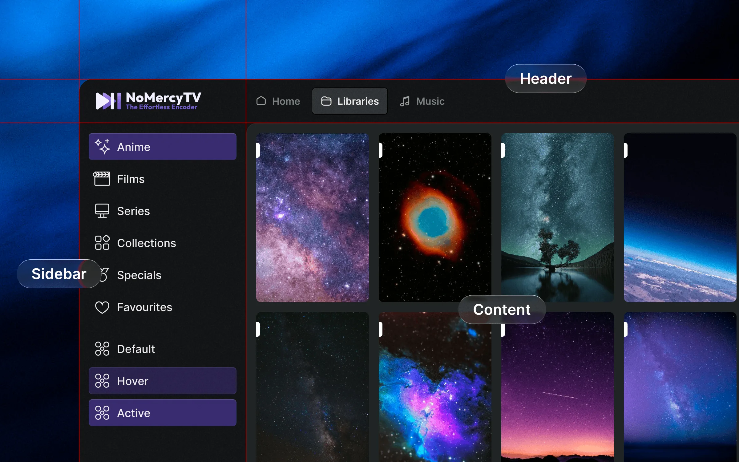
NoMercy.tv has a persistent header, a sidebar that hides on demand, and a central content card as the main workspace. This pattern is now common across the internet. When we built it, however, it was not yet a trend. I had been refining it since 2017, after noticing inconsistent navigation across screens in agency projects. The solution was to separate navigation from content. The navigation shell was designed once and fixed in place, while the content area remained the designer's daily workspace.
Years later, Spotify A/B tested a nearly identical layout. It lasted two weeks before they reversed it. I kept the pattern because it had already solved a structural problem. Two years later, Spotify brought it back as its permanent design language. The first design was right; the organisation was not ready for it. In NoMercy.tv, this three-part layout keeps the server interface, web app, and desktop and mobile clients consistent. Users do not have to relearn the interface when they switch platforms.
Outcomes
Working together removed the traditional designer-developer handoff. Decisions were implemented within days of discussion instead of waiting in a sprint backlog. This produced more iterations than a traditional engagement would have.
Three steps from download to watching, with no terminal, Docker, or config files. Usability removes barriers without removing power-user features. The product works for both homelab enthusiasts and people who have never used a server.
No roadmap predicted a music library, image viewer, or screensaver beside the core video product. These features came from weekly conversations. The cost is an unclear finish line. The benefit is a product shaped by real patterns, not assumptions.
A custom system replaced Material Design across the server UI, web app, Windows, macOS, Linux, and Android. It keeps interaction patterns consistent without relying on a framework. iOS and Apple TV are in development with the same system.