Started as a Figma UI Kit. Now it lives in your codebase.
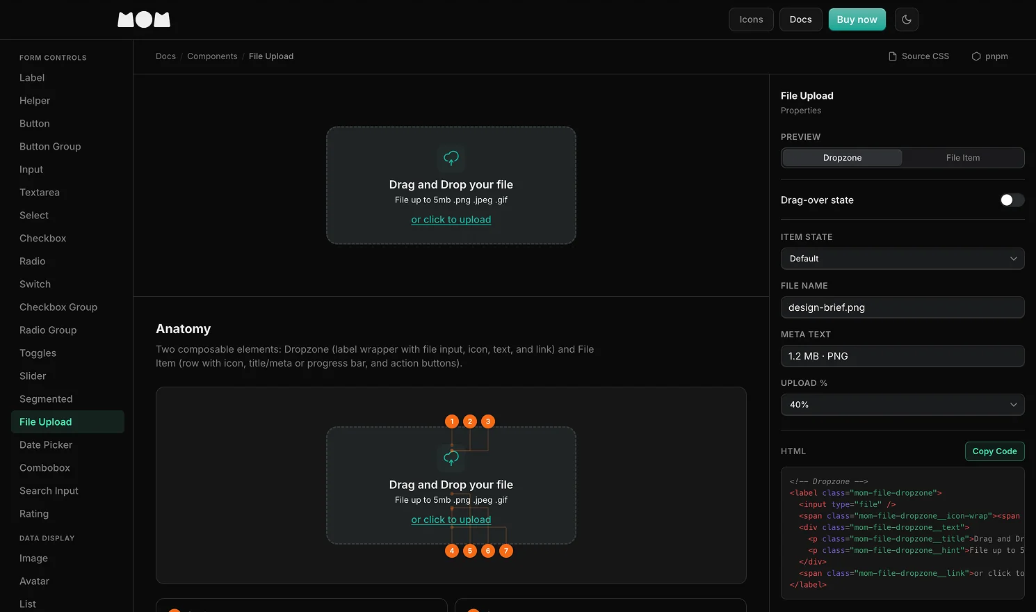
MooooM is a design system (UI Kit) that began in 2023 as a Figma component library, a way to build project pages faster and keep them visually consistent. The times changed. A UI Kit that only lives in Figma leaves developers rebuilding every token by hand. So we added the code side: 6,000+ icons, 38+ components, and 860+ design tokens available as npm packages for React, Vue, and vanilla CSS.
Product Designer · Figma · Design System
Scroll
Origin
This began with a personal problem, not an outside opportunity. Every new project started by rebuilding a UI kit from scratch. MooooM was a way to stop doing that. If it solved the problem well enough to use on every project, it could also help designers and developers with the same problem. We already belonged to that audience.
The pricing experiment
The self-imposed challenge was to start at $2 and double the price every week, while adding meaningful new content each time. Early adopters who paid $2 for 40 icons now have 6,000+ icons and 38+ components, and will receive the coded component library at no extra cost. The price has reached $100 and will probably settle near $140. The affiliate program pays 50% commission. Affiliates have generated more than $900 in revenue and kept the same amount themselves.
Signal so far
The product is a modest financial success and a strong technical one. The system now supports every new project, so it has solved the original problem. The active community is waiting for the coded-components update, which ships soon. The affiliate structure turned buyers into distributors without an advertising budget. The personal investment has already paid off; any further revenue is a bonus.
0+
icons across 4 styles
Line · Duo · Sharp · Solid
38+
accessible UI components
WCAG 2.1 AA · ARIA · keyboard nav
0+
design tokens
Colour · type · spacing · radius · effects
5
npm packages
mom · mom-pro · react · vue · web
01 · The Origin
A Figma Kit for faster, more consistent work
The breaking point was rebuilding the same date picker for the third project in one quarter. MooooM started in 2023 as a Figma component library for an immediate, practical problem: people working across several products spend too much time rebuilding the same UI elements. A button here, a badge there, or a modal just different enough to break the visual language. The first version was a shared Figma library for use across projects. It kept typography, spacing, colour, and component states consistent without forcing every page to recreate them.
The icon library came early. Icons are among the most copied parts of a product interface, and many free sets are either inconsistent or missing key categories. From the start, MooooM offered four styles: Line, Duo, Sharp, and Solid. A product can use one style throughout or mix them deliberately to create hierarchy without losing consistency.
A Figma Kit solves the designer's problem. It does nothing for the developer staring at a token that only exists as a variable in a frame.
The gap became clear over time. Figma variables map to CSS custom properties, and Figma components map to HTML patterns. But that mapping is usually implicit. A designer specifies color/neutral/900, then someone must translate it into a hex value, name a CSS variable, choose its place in the codebase, and repeat the process for every token. The code version of MooooM closes that gap. Developers install the same design tokens, components, and icons from npm that designers use in Figma.
02 · The System
Icons, tokens, components, each a layer, all connected
MooooM has three connected layers. The icon library contains 6,319 SVG files organised by style and category. Its 57 groups cover common UI needs, from system controls to finance, maps, media, gestures, and weather. Above it, the token layer contains 860+ design tokens based on Radix UI colour scales: 28 scales with 12 steps and alpha variants, plus typography, spacing, radius, and effect tokens. Every component uses these tokens, so changing one updates every component that depends on it.
Line
1,574 icons
Duo
1,587 icons
Sharp
1,584 icons
Solid
1,574 icons
The four styles support different uses, not only different looks. Line suits light informational interfaces. Duo gives marketing and feature pages visual weight without feeling heavy. Sharp fits dense, data-rich UIs where Line's rounded corners look out of place. Solid works for filled states, active toggles, and small sizes where strokes become hard to see. Sharp was not planned. It began as a one-off fix for a dashboard that clashed with Line's rounded caps, then grew into a complete 1,584-icon style.
TOKEN CATEGORIES
Colour
28 Radix scales
860+ tokens. 12 steps per scale, plus alpha variants. Dark-first, with light mode override. Generated by build-tokens.js from Radix UI source.
Typography
Inter, 9-step scale
Font family, weights (400–900), sizes (xs → 7xl), line heights, and letter-spacing. Naming follows Tailwind conventions for zero-friction adoption.
The same system designers use, available as npm packages
The code side of MooooM ships as five npm packages in a monorepo. mom is the free tier: the full CSS component framework with design tokens, the Line icon set, and the <mom-icon> web component, dark mode by default. mom-pro extends it with light mode, all four icon styles, and licence-gated access. The framework packages, @mom-ui/react, @mom-ui/vue, and @mom-ui/web, wrap the same HTML and CSS patterns in typed component APIs for each ecosystem.
The architecture is CSS-first. Every component uses BEM-named HTML and CSS custom properties for each visual decision. The React and Vue packages are thin wrappers that render the right HTML and manage interactive state; they do not control the visual layer. A product can use MooooM CSS without a JavaScript framework or use the React/Vue packages and get the same result. Design tokens and component styles stay identical in Figma, CSS, and framework components. A developer who once had to interpret a token in a frame can now run npm install and use it.
PackageWhat it includesTier
momCSS components + design tokens + Line icons + <mom-icon> web component. Dark mode.Free
mom-proEverything in mom + light mode + all 4 icon styles (Line, Duo, Sharp, Solid). Licence key required.Pro
@mom-ui/reactReact 18+ typed components. Requires mom or mom-pro for styles.Free
@mom-ui/vueVue 3+ typed components. Requires mom or mom-pro for styles.Free
@mom-ui/webFramework-agnostic web components. Requires mom or mom-pro for styles.Free
HTML · Vanilla CSSmom package, zero dependencies
<!-- Install: npm install mom --><link rel="stylesheet" href="node_modules/mom/dist/mom.css"><script src="node_modules/mom/dist/mom-icon.js"></script><!-- BEM class API, consistent with Figma component naming --><button class="mom-btn mom-btn--primary mom-btn--md"><span class="mom-btn__icon" aria-hidden="true"><mom-icon name="System/shield" variant="line" size="16"></mom-icon></span><span class="mom-btn__label">Save changes</span></button><!-- Icon web component, same category/name as Figma --><mom-icon name="Arrows/arrow-right" variant="duo" size="24"></mom-icon>
TypeScript · React@mom-ui/react, typed component API
The <mom-icon> web component is the bridge between the icon library and any runtime. It fetches SVG files by category path (System/shield, Arrows/arrow-right), normalises stroke colours to currentColor so the icon inherits CSS color, and caches fetched SVGs in memory so repeated uses of the same icon do not re-request. The base path is configurable for CDN usage.
04 · The Build
SVGs in, tokens in. Packages out
The monorepo has no manual token or icon maintenance. Two build scripts generate everything from source. build-tokens.js reads the @radix-ui/colors npm package and outputs a single system/tokens/colors.css with all 28 colour scales, dark default, light override, including both sRGB and P3 variants. Run it once when Radix updates a scale; the output propagates to every component that references those variables. build-icons.js walks src/icons/{Style}/{Category}/*.svg, strips non-essential attributes, and outputs one JSON file per style into icons/data/, which the icon browser and the web component both consume. The system that began as a way to stop rebuilding the same components now rebuilds itself.
The component packages are built with Vite in library mode. Each framework package (mom-react, mom-vue, mom-web) exports typed components and a single CSS file from the same source tokens. The build pipeline is one command: npm run build from the monorepo root triggers icon generation, token generation, and all five package builds in sequence.
MooooM's codebase was built with Cursor and Claude Code throughout. Shipping a cross-framework npm monorepo with a working build pipeline, typed component APIs for React and Vue, and a web component icon bridge, with a team this lean, is not a normal outcome. It became possible when AI tooling compressed the implementation loop. What that tooling cannot do: decide what the token naming convention should be, determine which icon styles to ship, figure out why the Figma-to-code parity matters to the people buying the kit, or invent the pricing experiment. Those decisions came from years of frustration with existing tools and a clear picture of the problem worth solving.
npm workspaces monorepo
5 packages under packages/ with shared tsconfig.base.json. Single npm install from root, single npm run build to publish all.
mom · mom-pro · react · vue · web
Zero-dependency core
The mom and mom-pro packages are pure CSS + vanilla JS. No bundler, no framework, no runtime cost. Framework packages are opt-in thin layers.
CSS custom properties · BEM · Web Components
Figma parity
Component names, variant names, and token names match Figma exactly. A designer specifying badge/ghost/teal/sm maps directly to .mom-badge--ghost.mom-badge--teal.mom-badge--sm.
Design → code · No translation layer
Capability
MooooM
Figma-only kit
Design tokens
Figma variables + CSS custom props
Figma variables only
Icon usage in code
Web component + JSON
Manual SVG copy-paste
Light + dark mode
CSS class toggle, localStorage
Figma modes only
Accessibility
WCAG 2.1 AA, ARIA, keyboard nav
Visual spec only
Framework support
React · Vue · Web Components
None
Token source of truth
Radix colors → CSS → Figma
Figma (manual)
Outcomes
The same system, everywhere it needs to be
The original problem is solved. Every new project starts with the tokens, icons, component patterns, and coded versions already in place. Setup that once took days now takes almost no time. That alone makes MooooM worthwhile; the revenue is a bonus.
The pricing experiment worked as planned. People who paid $2 when the product had 40 icons now own a much larger system and will receive the coded component library at no extra cost. The first $2 sale came through our social media pipeline, which mattered far more than the amount.
The affiliate program pays 50% commission and turned the early community into a distributed sales team. With no advertising spend, people who believed in the product generated more than $900 and put their reputations behind it. That structure was also a design decision: the case for the product had to be strong enough for early adopters to attach their names to it.
The meaning of a design system changed between 2023 and now. In 2023, it meant a Figma file. Today, it means a Figma file, five npm packages, a token pipeline, and components for React, Vue, and vanilla CSS. MooooM grew to cover every place where design decisions live, with one update left before that work is complete.