Brand identity for
a social aggregator

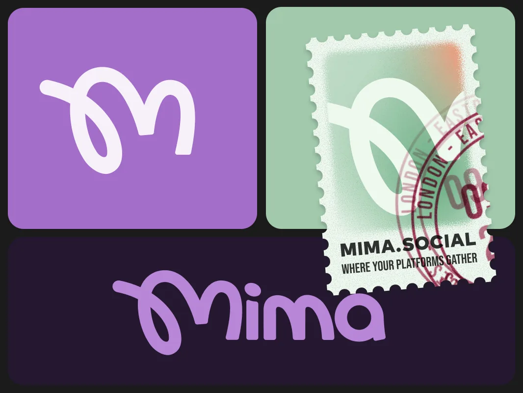
Mima unifies your friends across their existing networks, so we had to create a mark that signals connection without possession.
401 logo explorations and 22 colour systems later, the identity ships as a living, token-based Component Kit delivered as code, not as a PDF.

Design Lead · Brand Identity · Component Kit

0×
Logo variations explored
From sketch to vector
0
Colour palettes tested
Ube won with 60% of votes
0
Days of focused work
Across 2 sprints
0+
Lines of code delivered
Many more across branches

01 · Brief

Problem, constraint,
and the target audience

Mima is a social aggregator that brings friends' posts, chats, and updates from existing networks into one view. Users do not need to join a new platform or migrate their data. The brand had to appeal to a 16-year-old while earning the trust of parents, investors, and the tech press. Its voice needed to speak to teens first while remaining clear to adults: bold, but not disposable.

The app sits beneath existing networks instead of competing with them. The tagline "Where your people are" guided every decision that followed. The logo, palette, and voice all needed to feel credible to teens and in a boardroom. The brand had to be personal without feeling frivolous, and distinct without clashing with the platforms around it.

"The identity must work for a 16-year-old, their parents,
investors, and press, simultaneously."
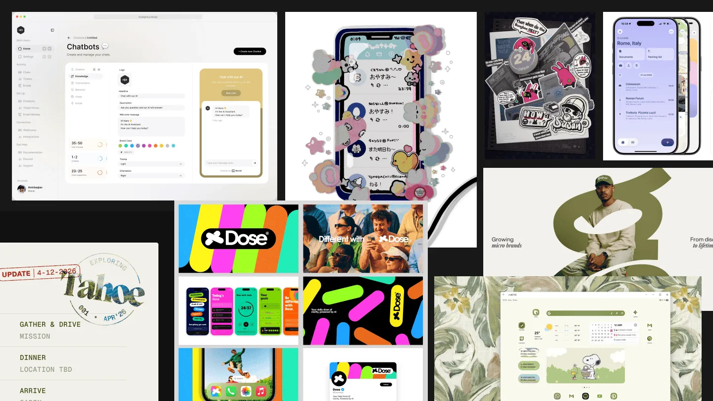
Initial brief & mood board

02 · Logo

401 explorations,
one definitive mark

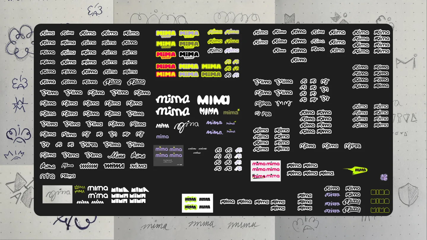
After more than 400 iterations across three directions, the final mark became one continuous stroke: a loop that suggests a connection across a gap, exactly what the product does. We rejected the geometric and letterform directions because they looked like standard app icons or another social network. Neither suited a product that works beneath other platforms rather than acting as one.

The final mark can be drawn in one motion, animated along its path, and used at any scale from 16px to a billboard. More than 140 refinement passes adjusted its stroke weight, curve tension, endpoint radius, and cap behaviour. The original stroke took about four seconds to sketch near the end of the first few days. Making those four seconds work at 16px took the next 140 passes.

Logo exploration, 401 variations
01
Geometric forms Circles, squares, intersections. Discarded, clean but cold, indistinguishable from standard app-icon language.
02
Letterform abstractions The M as structure: ligatures, stacked glyphs, negative-space plays. Discarded, too literal, read as another social network.
03
Gesture & continuous line Unbroken stroke, the breakthrough direction. Works at every scale, animatable along its path, readable at 16px.
04
Refinement 140+ passes on stroke weight, curve tension, endpoint radius, and cap behaviour. The mark's simplicity is the output of this work.

The delivered mark

Mark
Wordmark
Mark · Brand

03 · Colour

22 systems tested
Users validated the winner

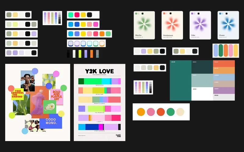
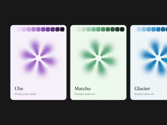
We developed 22 complete colour systems before choosing four finalists. Each had its own logic, mood, and 11-step token scale from 50 to 950. Every network Mima brings together already owns a strong colour, so Mima's palette had to coexist rather than compete. We used the same method as the 401 logo explorations: produce many options, then judge them. The palettes were named after food (Ube, Matcha, Just Orange) because emotional names caused studio arguments, while food names created agreement.

60% of the panel independently chose the Ube (lavender) palette. It was neither the safest choice nor the usual tech-startup direction, but it felt most personal to them. A representative panel of teens and adults saw the four finalists in identical mock interfaces without leading context. The vote gave the client user evidence for investor conversations and showed that the audience wanted to feel seen, not only served.

"60% of users picked lavender, because it felt like theirs."

Apply a palette, see the page change

Ube · winner · 60% user preference · 11 stops

50
100
200
300
400
500
600
700
800
900
950

Matcha · runner-up · tested palette #16

50
100
200
300
400
500
600
700
800
900
950

Glacier · tested palette #17

50
100
200
300
400
500
600
700
800
900
950

Just Orange · tested palette #11

50
100
200
300
400
500
600
700
800
900
950
The 22 palette candidates
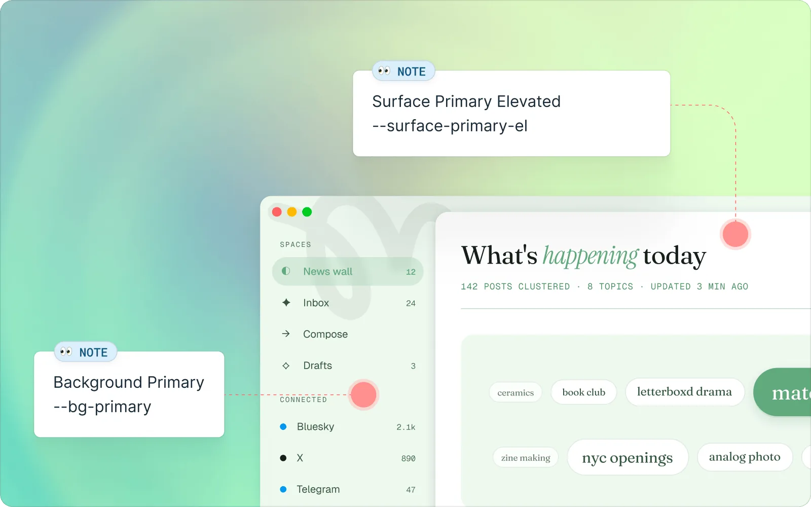
Matcha, semantic token mapping

04 · Component Kit

Living token architecture
4,000+ lines delivered

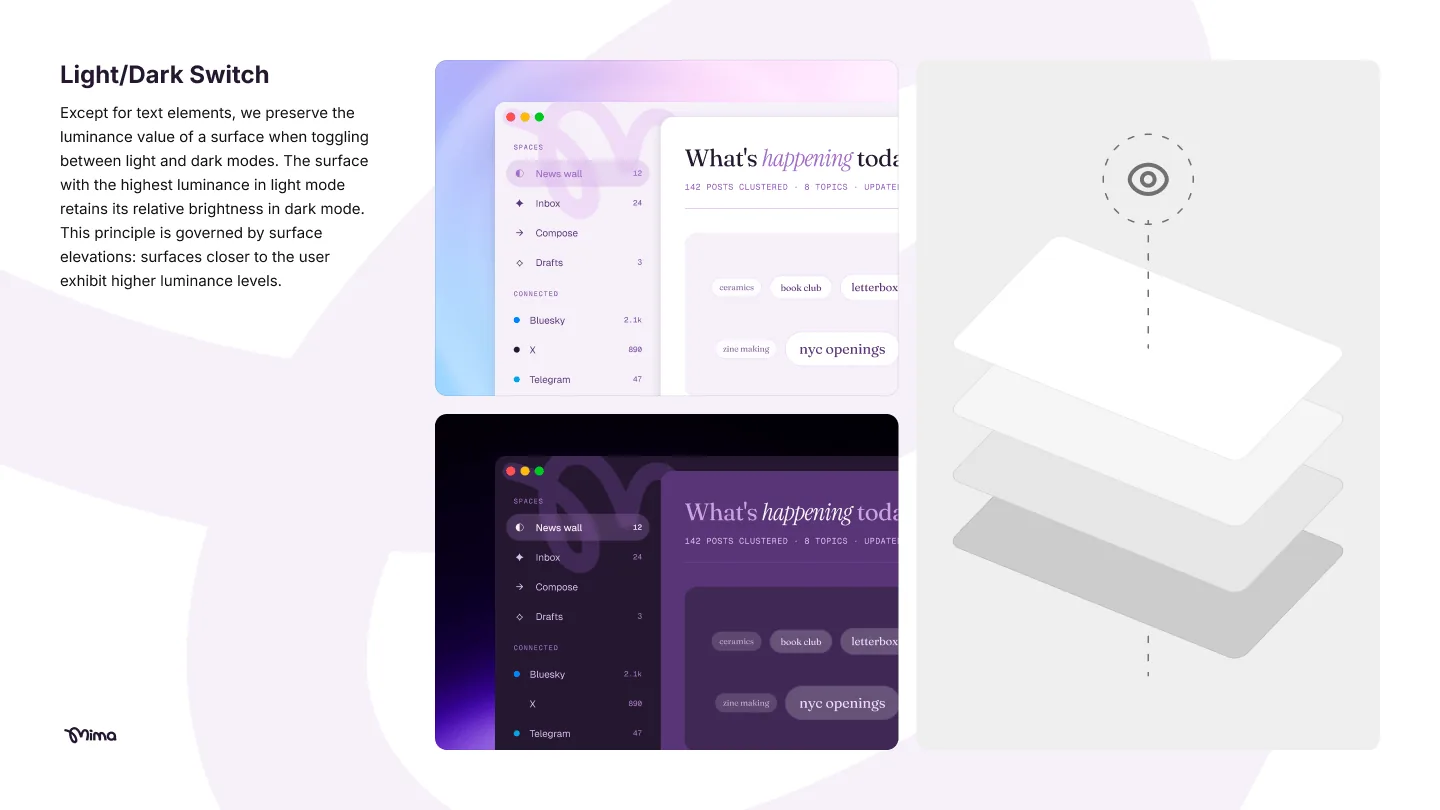
The brand system follows the product's main principle: nothing is locked in. It applies the mark's promise, connection without possession, to the engineering. Tokens replace hardcoded values. A theme-switchable CSS architecture lets any engineer extend the system without opening design files. The styleguide lives in a browser instead of behind a paid Figma seat, so the whole team can use it.

The deliverables include the mark and wordmark family, 11-step colour scales, a full type scale, spacing and radius tokens, a component library, and a linked Ube styleguide. The main branch contains more than 4,000 lines of code, with many more across exploration branches, rejected palettes, animation curves, and layout approaches.

The system was built with Cursor and Claude Code. AI tools made it possible to deliver a living, browser-native Component Kit within a 26-day engagement. Design still led the decisions that shaped the system: naming conventions, the 11-step scale, and the way semantic aliases are exposed.

/* Token architecture, theme-switchable with a single attribute */
[data-theme="ube"] {
  --a-50: #f5f0f8;  /* surface tint */
  --a-500: #9b6fc4;  /* primary */
  --a-950: #22182e;  /* deep */
}
/* → same structure × 22 palettes = zero hardcoded values in components */

Live component preview

Mima

everyone migrated to bluesky and now i have to check five apps again. mima just connected all of them. literally why did this take so long

48 12 Save

turned on the Bubble a week ago. haven't seen a single reply from a stranger who wanted to ruin my day. this is just the internet being normal actually

401 26 Copy
Icon system, delivered set 124 icons
Delivered Component Kit, full overview
Logo family
Type scale
Colour tokens

Outcomes

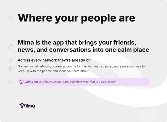
Where your people are

Each phase was tested with the same two audiences: teens and the adults who fund, build, and report on the product. The brand does not give them separate things to like. It uses one set of decisions that works for both.

The user vote validated the palette. The mark passes every size and context test we designed. The token architecture lets any engineer maintain the system without a Figma seat. "Where your people are" states the product idea in four words, and the Component Kit makes the same promise: Mima holds nothing that is not already yours.

View the styleguide