AAOA.studio · Case Study · Design · React · Tauri
A privacy-first alternative to Discord and Slack, built on one conviction: the server rail is a habit, not a law. Communities become browser-style tabs, encryption is post-quantum by default, and the judgment call was spending complexity on navigation people use every minute instead of features they find once.
01 · Problem
Market gap: Discord and Slack offer mature community infrastructure (servers, channels, roles, permissions, voice) but store messages unencrypted. Signal and Matrix provide end-to-end encryption but lack the rich server and channel structures communities depend on. No product spans both sets of requirements.
Navigation problem: the permanent left-rail server list does not scale past a handful of communities. Every server is always visible regardless of active use, competing for attention and screen space. The model assumes one or two servers; most users now manage dozens across games, work, and communities.
A secure community platform: servers, channels, roles, DMs, voice, and post-quantum encryption in a single product.
Scope: Jolkr is a full community platform, not a secure messenger. The front-end spans servers, channels, roles, DMs, voice, and the navigation system that ties them together. The encryption layer covers both DMs and group channels. The target surfaces are web, macOS, Windows, Linux, Android, and iOS from a single React + Tauri codebase.
02 · Navigation
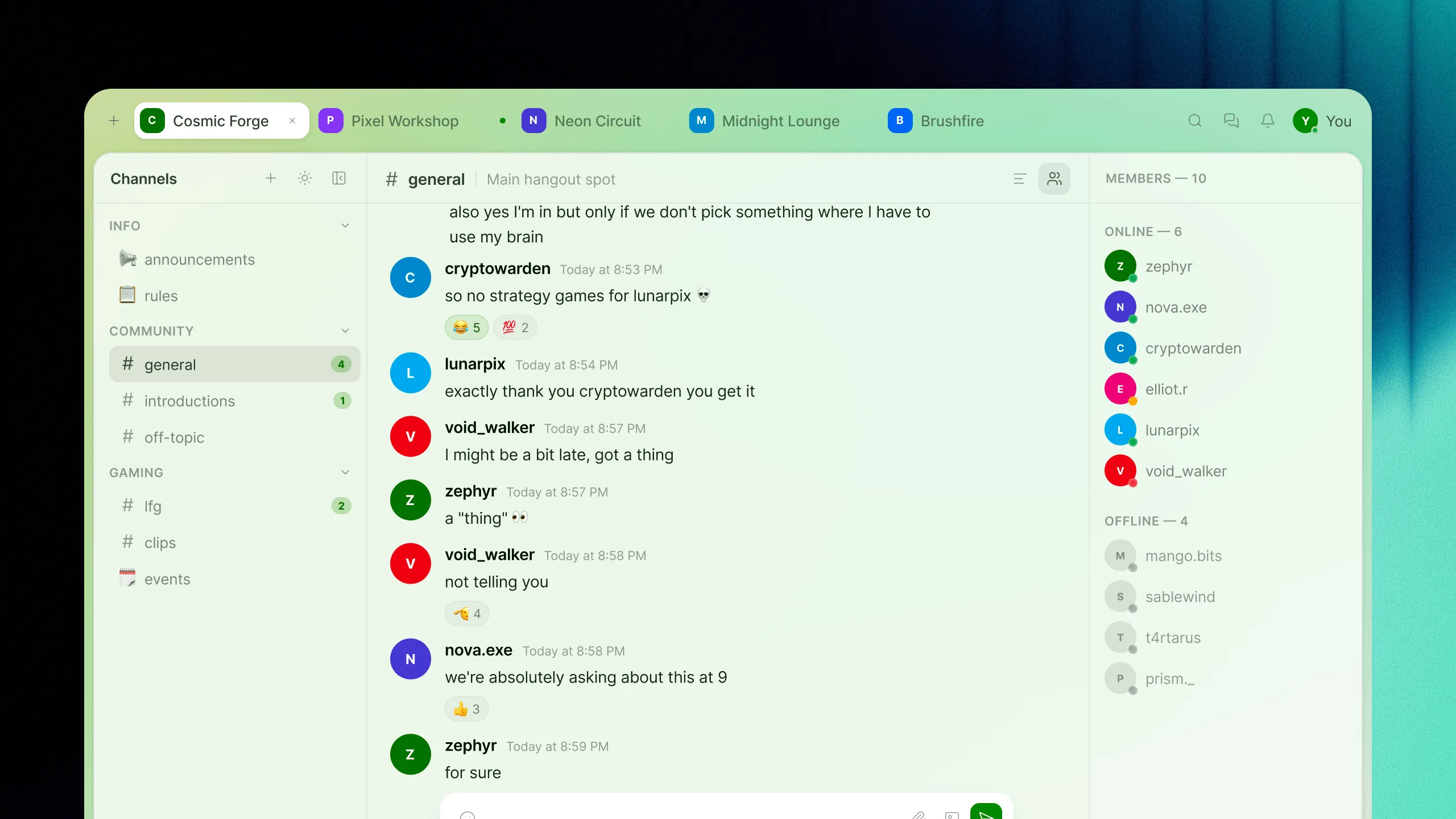
Decision: replace the permanent left-rail server list with a horizontal tab bar at the top of the interface, modeled on how browsers handle open pages. The decision has a specific origin: counting the icons on the studio's own Discord rail one morning, we got thirty-one servers! But only four in daily use. Servers are context windows that can be opened, switched between, and closed, rather than a fixed fixture that grows with every community joined.
Implementation: opening a server creates a tab showing icon, name, and unread indicator. Tabs are draggable for reorder, closeable via middle-click or close button. The tab strip scrolls horizontally with a CSS mask-image fade at the edges, computed at sub-pixel precision from scroll offset via a RAF-based lerp loop — no extra DOM, no layout thrashing. The fade went through three implementations before this one; the first two stuttered visibly and were clipping the content too harshly, and a navigation that stutters is a navigation element nobody trusts.
Input models: on touch platforms drag-reorder is disabled to prevent scroll conflicts, and long-press replaces right-click for server management (mute, mark read, settings, close, leave). The DM inbox, global search, notifications, and user profile live in the right side of the bar, always accessible from any tab.
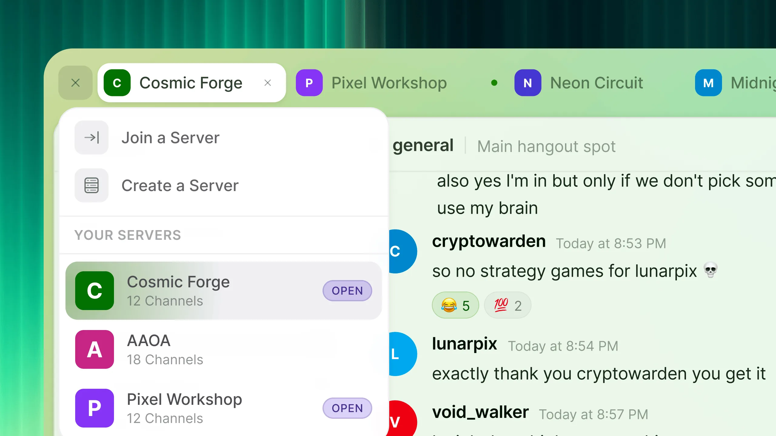
Server browser: accessible via a + button at the far left of the tab bar, shows every server the user belongs to, indicates which are already open, and provides join or create actions. A navigation tool rather than a permanent fixture.
03 · Encryption
Constraint: end-to-end encryption is mandatory in every conversation, never a setting the user enables. Because there is no unencrypted mode, the interface never presents a toggle: security is architectural, not optional. This eliminates an entire category of UX complexity: the design problem shifts from "how to configure encryption" to "how to communicate that it is working."
Design response: trust is communicated through ambient visual indicators rather than settings panels. A shield badge on every channel header signals encryption is active; nonce presence serves as proof of integrity; verified states on DMs confirm the recipient's identity. The encryption layer recedes during normal use; you never think about key exchange, and it surfaces immediately when something is wrong. Security that is legible when it matters and invisible when it does not. It is the same complexity budget as the tab bar: spend it where people look every minute, hide it where they should never have to look at all.
04 · Platform
Constraint: six target surfaces (web, macOS, Windows, Linux, Android, iOS) from a single codebase with no platform-specific forks. Every interface decision must hold across screen sizes from 375 px to 5120 px, input models (mouse, touch, keyboard), safe-area geometries, and OS conventions. A layout that works on a 27-inch monitor must also work on a phone; a component designed for a wide sidebar must not break in a narrow panel.
Architecture: each platform is treated as a viewport into the same component and layout system, not a separate design target. 62+ React components are each scoped to a single responsibility (tab bar, server browser, DM sidebar, message composer) and composable without coupling. The design system enforces edge-to-edge layout with safe-area awareness built into the grid primitives rather than patched per platform. Consistent behaviour across six surfaces comes from one component set, one layout system, and a state model designed for real-time sync without visual drift between instances.
Outcomes
Navigation: the tab-bar model replaces a permanent server rail that cannot scale past a handful of communities. Servers become closable context windows, so the interface is shaped by active use rather than total membership, a mental model familiar to anyone who has used a browser. Thirty-one icons collapse to the four tabs that matter.
Encryption: privacy is the only mode the application has, not a feature the user enables. The interface communicates this through visual indicators (shield badges, verified states) rather than settings panels, and the server never has access to message content by design.
Scope: six target surfaces from one component set, with consistent behaviour across web and native platforms. 62+ React components compose into a system designed for dozens of simultaneous community contexts. The key decisions, the tab metaphor, the encryption UX, the interaction model for context switching, were design-led, not engineering-driven.
Try Jolkr