Most fragrance apps want you to buy more. Prefume is built on the opposite premise: your collection is already full of things you love and forgot about. Use them. Remember them.
Product Lead · iOS · SwiftUI
Accent
Scroll
Opportunity
Serious fragrance collectors test more than 100 scents a year. Impressions fade, opinions change, and the memory of wearing one scent disappears by the next bottle. Existing apps promote the next purchase, but none help you remember what you already thought. The idea was simple: a journal that records the full test, from first spray to collection decision, is more useful than another discovery feed.
Decision left out
No discovery section, promoted content, or pressure to buy more. Most users already have a collection waiting for them. The backlog is the problem, not a shortage. Removing advertising was the core product decision. It became the most praised part of the app. Users said they trusted it because it had no commercial pressure.
Signal so far
1,000+ users. 5 sessions/day. The structured testing workflow (first spray, 2h, 4h, end of day) naturally brings users back. Revenue is about $300 from a $25 one-time purchase. Users praise the design and depth of the journal. If starting again, I would launch with fewer features: the depth that dedicated collectors love can confuse new users. Biggest gap: database coverage. Even 40,593 entries are not enough for a niche this deep.
0+
active users
Since launch · July 2025
5/day
average sessions per user
Structured testing workflow
0
reference fragrances in catalogue
1,671 brands · still not enough
$25
one-time purchase · no subscription
Extract tier · lifetime access
01 · The Journal
Your collection is full. Your memory is empty
Prefume began with one shelf. In early 2025, I found a decant at the studio but could not remember how it had worn. That afternoon, I sketched the first timeline view in a SwiftUI file. Fragrantica, Parfumo, and fragrance forums are discovery tools built around the next purchase: new releases, new houses, trending notes, and community wishlists. They are good at suggesting what to smell next, but not at helping with the forty scents already on your shelf: bottles worn twice and forgotten, a six-month-old sample with no memory attached, and a collection growing faster than the attention it receives.
The goal was not to help you find more but to help you remember what you already have.
Prefume follows the natural rhythm of fragrance testing. Its journal records the full process from first spray to collection decision. Each fragrance has a timeline: first test, 2-hour check-in, end-of-day impression, a compliment in November, and the decision to buy again. Impressions no longer fade or change without a record.
THE TESTING WORKFLOW
01
Sample or acquisition
Log how you obtained it, decant, sample vial, full bottle. Sets the context for everything that follows.
02
Structured check-ins
First test, then 2h and 4h entries. Fields for projection, mood, weather, occasion, and a free-form note.
03
Collection decision
Acquire, pass, or mark as never again. The decision becomes a permanent entry on the timeline, alongside everything that informed it.
04
Wearing and lifecycle
Once in the collection, log each wear. Compliments, layering combinations, bottle level changes, revisits, repurchase decisions.
Baccarat Rouge 540 · Maison Francis KurkdjianTimeline · 12 entries
1
First Test
Opens with a sharp, almost medicinal quality, amber and cedar more prominent than I expected from the reputation. Strong projection.
Oct 12, 9:14
2h
2h Check-in
Settled considerably. The sweetness has come through. Still strong, got a comment from a colleague unprompted.
Oct 12, 11:28
W
Wearing
Cold morning. Layered with a small amount of Oud Wood on the wrists. The wood note grounds the sweetness well.
Nov 3, 8:02
C
Compliment
Two people asked what I was wearing at the same event. Both immediately.
Nov 3, 19:45
02 · Today
What to wear from what you already own
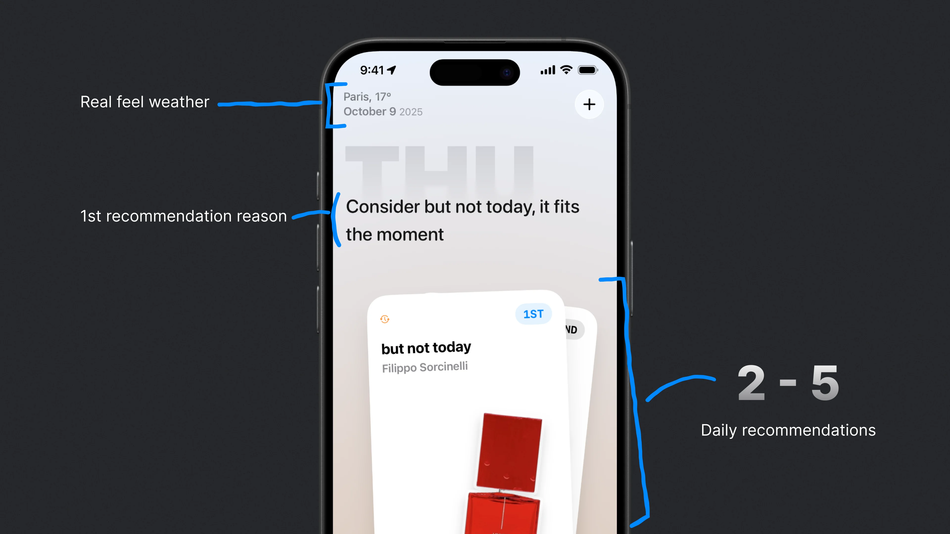
The Today view answers a simple question: based on your collection, the weather, and what you wore recently, what should you wear this morning? It recommends only bottles you already own. This deliberate limit keeps the focus on using your collection rather than growing it. The design question was not how to find the best new scent, but how to rediscover one you already bought.
The first recommendation system was too complex too soon. It used nine scoring dimensions that needed months of journal data to become useful. For a new user with twenty fragrances, nine signals were just noise. The rebuild used three reliable inputs: collection status, weather fit, and overall preference patterns. We added complexity only when it had a clear purpose, such as hiding fragrances you rated poorly yesterday and extending the repeat window as your collection grows. The system became simpler and more useful.
Reducing the system to three inputs did not lower its quality. It made honest use of the data that was available.
Each fragrance in the reference catalogue has pre-computed context affinities for weather, time of day, and season. Recommendations can fit the context without pretending to know you better than your journal does. The catalogue contains 40,593 fragrances from 1,671 brands, but coverage is still the main gap. In a niche this deep, even forty thousand entries may not include a regional house or obscure extrait.
TODAY · RECOMMENDATION SCORES
Morning · 9°C · Rainy · London
Baccarat Rouge 540
0.88
Sauvage EDP
0.74
Tom Ford Oud Wood
0.68
Acqua di Gio
0.31, worn yesterday
Light Blue
0.22, low rating ×2
03 · Craft
An app that feels like the practice
Fragrance collecting is sensory, so the app needed to match both the practice and its feeling. One principle guided every detail: the interface should feel like the activity it supports, turning physical rituals into digital interactions that collectors recognise at once.
THE SPRAY ANIMATION
Getting the mist right took longer than the rest of the logging flow combined. I tuned the emitter values against slow-motion footage of a real atomiser filmed on a desk, and I am still refining it. Logging a wear triggers a SpriteKit dual-emitter spray animation from the bottom of the screen, with droplets and mist fading at the edges. It reflects the physical act of applying fragrance. Collectors noticed it immediately because it shows that the app understands the ritual, not only the data model. It became one of the details users mentioned most.
RESPONSIVE ENVIRONMENT
Each view has a background that responds to your collection. Colours drawn from perfume notes blend into ambient gradients: warm amber after a morning wear, cool blue after fresh citrus, and deep purple after a patchouli-heavy evening. The app's visual temperature changes with the day's fragrances, connecting the interface to its content instead of treating it as a static container.
Bottle-driven palettes
Dominant colours from perfume notes become the ambient gradient for each session.
Olfactory spider chart
A custom radar mapping note families, so you can see a fragrance's character at a glance.
Prefume Wrapped
Year-in-review from journal data: most worn, biggest opinion shift, largest collection change.
The spray animation, gradient backgrounds, and paper-like entry cards are parts of one design language built on the journal's data. Every screen presents the collection, wear history, and preferences in the same way because the system is consistent. The design decisions support each other instead of competing for attention.
04 · Model
Free for the journal. Extract for everything else
Most collectors regularly wear fewer than fifteen fragrances. The free tier reflects that: up to twelve fragrances in the collection, twelve on the wishlist, and full access to the journal, recommendation engine, and catalogue search. Everything that makes the app useful is free. Collectors who commit to the practice can pay to remove limits, not to unlock core features. As with the missing discovery feed, the app earns trust by not pressuring users to spend.
Extract is a one-time lifetime purchase with no subscription. It removes the collection limit and supports larger CSV imports for people moving from spreadsheets. The name is deliberate: in perfumery, extract is the highest concentration. It suggests purity, not simply more features. Revenue is modest so far, about $300 at $25 per user. That may be fair pricing for a niche tool, or it may show that the market is smaller than the product's depth suggests.
Catalogue search 40,593 fragrances, full note pyramids
Extract · one-time purchase
Higher concentration
Unlimited collection No cap on fragrances or wishlist
CloudKit sync Journal and collection across devices
CSV import Migrate large collections from other tools
Lifetime access No subscriptions, no renewals
Outcomes
The record is the product
Engagement: 5 sessions per day comes naturally from how collectors already assess a fragrance. The structured workflow (first spray, 2h, 4h, end of day) supports an existing practice instead of inventing a new habit.
Positioning: users said the lack of commercial pressure was the main reason they trusted the app. This confirmed that rejecting discovery and ads was the defining product decision. A daily public build log on TikTok tested that belief: users watched features develop and responded in real time. Their feedback about complexity in the first two weeks also sped up the recommendation engine's move from nine scoring dimensions to three reliable inputs.
Onboarding lesson: the testing workflow, recommendation system, and wrapped review each work well on their own, but together they can overwhelm new users. Collectors who continue become devoted users, but some leave before seeing the value that appears after a few weeks of journaling. Depth is both the product's strength and its onboarding problem.
Scope: 390 commits across SwiftUI, SwiftData, and GRDB. The work includes a SpriteKit spray animation, three versions of the recommendation engine's architecture, and a reference catalogue of 40,593 entries from 1,671 brands. The most important changes were design decisions: reducing nine scoring inputs to three, replacing discovery with journaling, and helping people use what they own instead of buying more.